Week 12: Interface and application programming
This week we followed the interface and application programming class (see video here)
This page is about the individual assignment.
I decided to use as a task interpreting my accelerometer sensor data from week 10.
Exporting data from the board
Before starting I decided to export the accelerometer data from my board.
I worte a simple program reading sensor data every 10ms from the accelerometer and outputing it as a JSON object format.
void loop() {
  _delay_ms(10);

  int16_t x = accelerometerRead(REG_DATA_X);
  int16_t y = accelerometerRead(REG_DATA_Y);
  int16_t z = accelerometerRead(REG_DATA_Z);

  output = String("{x:") + x + ",y:" + y + ",z:" + z + "}";
  Serial.println(output);
}
Then I created a python script to export my accelerometer sensor data to a JSON file for easy manipulation in Javascript.
import serial
import sys

def get_port_from_command_line_arguments():
    if (len(sys.argv) != 2):
       print( "command line: serial_dump.py serial_port" )
       sys.exit()
    return sys.argv[1]

serial_port = get_port_from_command_line_arguments()

ser = serial.Serial(serial_port, 9600)
ser.setDTR()

ser.flush()

while 1:
   sys.stdout.write(ser.readline().decode())
   sys.stdout.flush()
My sample data looks like this:
[
  {"x":256,"y":-2,"z":1},
  {"x":259,"y":-2,"z":-2},
  {"x":256,"y":1,"z":1},
  {"x":256,"y":-2,"z":0},
  ...
]
Download sources code (.zip archive: .ino sketch and .py script)
Javascript and D3.js visualizations
I wanted to try since long time D3.js.
D3.js is a JavaScript library for creating dynamic, interactive data visualizations directly in the web browser using CSS, DOM and SVG manipulations.
At this point I started looking at D3.js.
D3.js documentation is very comprehensive and easy to get lost in hundreds of examples. Some of these are built with old version of the API < v4 that is incompatible with the current one.
I ended up using mainly the Scrimba introductory tutorials, and Scott Murray’s tutorials. The latter are based on the old API but useful to understand the concepts.
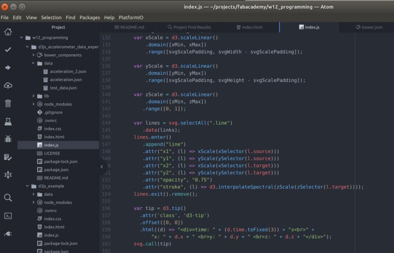
Once the data is loaded I decided to take the approach of using SVG visualizations for creating a scatter chart of my data. The code looks more or less like this.
var circles = svg.selectAll("circle")
  .data(data_points);

circles.enter()
  .append("circle")
  .attr("r", radius)
  .attr("cx", (data_point) => xScale(data_point.x))
  .attr("cy", (data_point) => yScale(data_point.y))
  .attr("fill", (data_point) => d3.interpolateBlues(yColorScale(data_point.z)))
Is interesting to notice that with D3.js is easy to do:
- data driven visualizations
- scaling data and creating axes for a chart
- using color interpolation scales
- data transformation and animations
A huge variety of plugins are available but I didn’t go in details. I only used d3-tip to create tooltip boxes when the mouse hovers a data point on the charts.
I built multiple charts to be able to see the same data from different perspectives.
Finally I introduced jquery to build some simple input controls to load different data samples, and zoom the visualization to a smaller time frame.
These controls are useful also because at 100hz / 20sec of data (2000 points) the charts vstart becoming a little slower and hitting performance limits are around 10000 points.
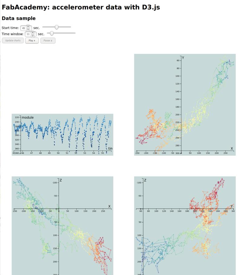
The interface and full sources are reachable as a live demo here
Lessons learned
- D3.js is an easy to use, extremely flexible and useful tool for visualizations but some visualizations are appropriate for small quantities of data only
Next steps
- Various improvements in the D3.js application: investigate performance improvements, range selectors when hovering charts, add real-time based data animations (on click ‘play’)
- Visualize the same data with Unity on a mobile phone
- I would like to experiment in the future with Three.js, Unity and a bit of Kotlin on Android